The Basketball Hall of Fame

Reimagining a legacy institution’s digital experience

Overview

The Basketball Hall of Fame wanted to modernize its digital presence - clarifying navigation, unifying fragmented experiences, and better showcasing the history, events, and cultural impact of the sport.

My role

Lead UX/UI Designer
UX Strategy
Design Systems
Stakeholder Collaboration

Deliverables

UX Design
UI Design
Information Architecture
UX Strategy

The Problem

Years of incremental updates, new content types, events, and organizational changes had resulted in a fragmented, text-heavy experience with cluttered navigation, inconsistent content patterns, and limited storytelling. The site no longer reflected the energy, emotion, or cultural impact of the Hall itself.


Key goals:

  • Drive museum visitation and ticket sales

  • Highlight events and Enshrinement Weekend

  • Support a robust, searchable Hall of Famers archive

  • Drive donations and awareness to philanthropy

  • Make the site easier to maintain amid frequent updates

Old Site

Discovery & insights

Analytics, heatmaps, stakeholder interviews, and competitive research revealed several opportunities to simplify navigation, make high-value content easier to notice, and better align the experience around visitor goals.

Key insights:

  • Visitors largely relied on navigation and ignored page content

  • Hall of Famers was an area of top site engagement

  • Ticket info was a primary goal but difficult to access

  • Users were overwhelmed - they scrolled but engaged with few content areas

  • Content hierarchy and navigation structure created unnecessary friction


Key insights:

  • Visitors largely relied on navigation and ignored page content

  • Hall of Famers was an area of top site engagement

  • Ticket info was a primary goal but difficult to access

  • Users were overwhelmed - they scrolled but engaged with few content areas

  • Content hierarchy and navigation structure created unnecessary friction


heatmap analysis

Information architecture

The research showed that navigation was a major friction point. Users struggled to find key content due to unclear hierarchy and competing pathways.

Challenges:

  • Cluttered navigation

  • Redundant categories

  • Unclear hierarchy

  • Poor grouping


My approach:

  • Consolidated content into clear categories

  • Simplified navigation to reduce cognitive load

  • Prioritized visitor goals: Visit, Events, and Hall of Famers

  • Created a more intuitive journey for first-time and returning visitors

My approach:

  • Consolidated content into clear categories

  • Simplified navigation to reduce cognitive load

  • Prioritized visitor goals: Visit, Events, and Hall of Famers

  • Created a more intuitive journey for first-time and returning visitors

Before

Multiple navigation pathways made it difficult to prioritize key visitor goals.

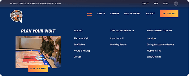
After

Streamlined to 5 primary navigation pillars, clear groupings, and strong calls-to-action
Wireframes

Designing the framework

The wireframes defined a flexible content framework, page structure, hierarchy, and user flows.

  • Created scalable page structures from a system of modular components

  • Prioritized key user tasks including tickets, museum visitation, exhibits, events and Hall of Famers

  • Established consistent patterns and reusable templates across key page types

Brand & visual direction

Modernizing the brand experience, while preserving the institution's legacy

My approach:

  • Led the creative direction and visual design of the website

  • Defined a scalable design system that unified disconnected experiences across key areas

  • Repositioned how visitors experience and connect with the Hall

My approach:

  • Led the creative direction and visual design of the website

  • Defined a scalable design system that unified disconnected experiences across key areas

  • Repositioned how visitors experience and connect with the Hall

Key design principles:

Key design principles:

  • Energy and emotion

  • Prestige and legacy of the Hall

  • Flexible, scalable design system

  • Visual storytelling

  • Energy and emotion

  • Prestige and legacy of the Hall

  • Flexible, scalable design system

  • Visual storytelling

Hall of Famers experience

Improving content discovery

Key challenges:

  • People wanted search/filter, not browsing

  • Filters were hidden + frustrating

  • The photo grid was visually overwhelming

Key challenges:

  • People wanted search/filter, not browsing

  • Filters were hidden + frustrating

  • The photo grid was visually overwhelming

Key challenges:

  • People wanted search/filter, not browsing

  • Filters were hidden + frustrating

  • The photo grid was visually overwhelming

My approach:

  • Prioritize filtering and search

  • Reduce cognitive load

  • Improve scannability

  • Create a consistent, easy-to-navigate storytelling experience for each Hall of Famer

My approach:

  • Prioritize filtering and search

  • Reduce cognitive load

  • Improve scannability

  • Create a consistent, easy-to-navigate storytelling experience for each Hall of Famer

My approach:

  • Prioritize filtering and search

  • Reduce cognitive load

  • Improve scannability

  • Create a consistent, easy-to-navigate storytelling experience for each Hall of Famer

Before

After

People don't visit what they can't imagine.

The Outcome

A bold, cohesive digital platform that positions the Basketball Hall of Fame to scale content, unify experiences, and guide users to meaningful action.

© 2026

All Rights Reserved

© 2026

All Rights Reserved

© 2026

All Rights Reserved

Create a free website with Framer, the website builder loved by startups, designers and agencies.